Apex Energy
Apex Energy is an original energy drink brand featuring three unique creature designs. When deciding to create energy drinks specifically, I wanted to further test my illustration experience by depicting a bold, grungy style paired with sharp, expressive line-work and bold, consistent colors. Combined with energetic typography and special glow effects, the finished product experience is energizing and powerful, encouraging consumers to find their inner apex predator and achieve.
Character ideation


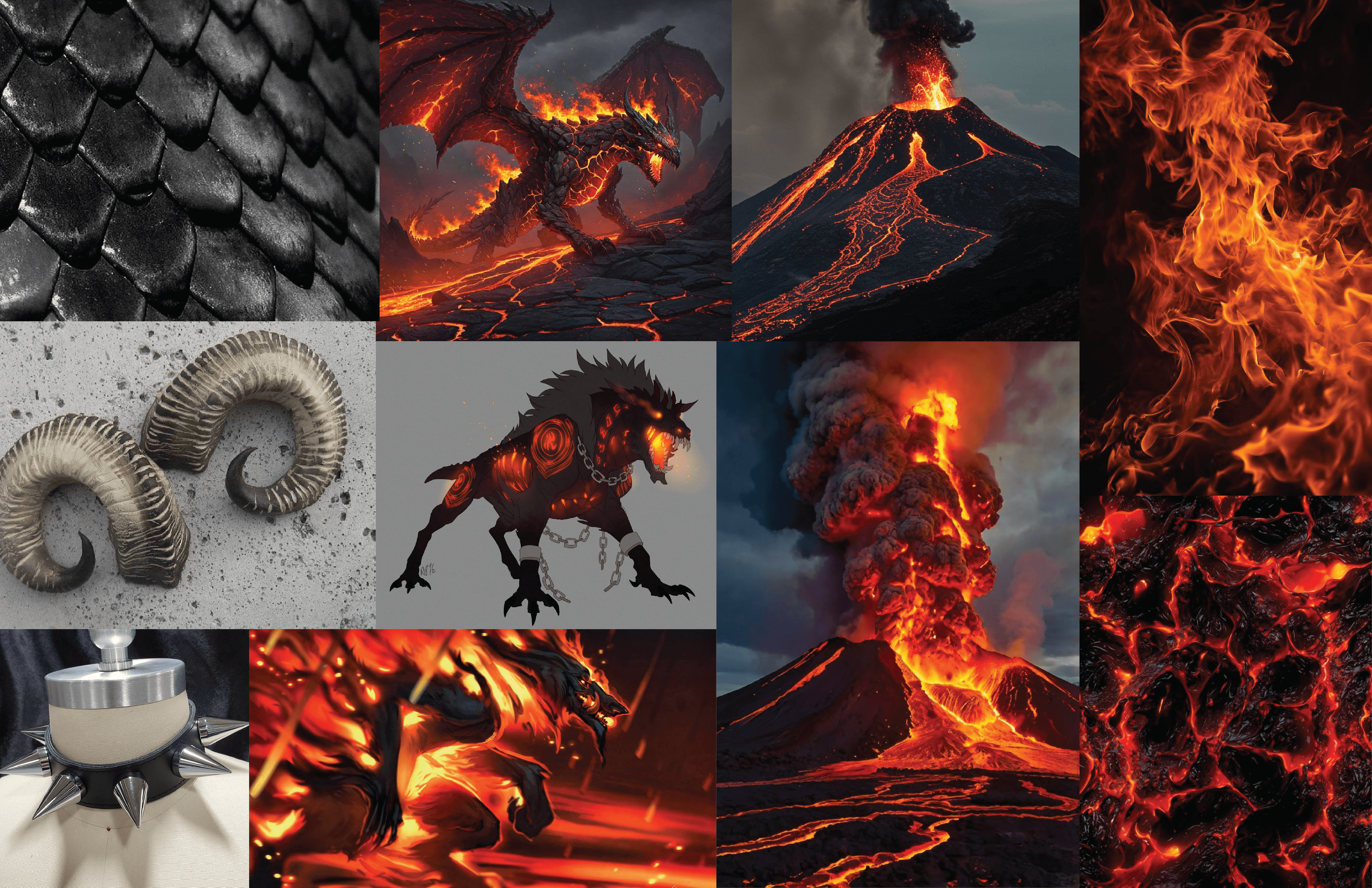
To further understand the goals of this brand, I began thinking about what creatures I would be depicting. It was important to me that the designs appear powerful, thematic, and primal, so I first considered using real animals and their environments. During my research, however, I found that many other beverage companies already used a similar theme. As such, I explored the idea of powerful, ancient beasts who share traits with many existing animals. These moodboards, one for each creature design, were intended to explore the traits of these magical beasts, including their environments and accessories or textures I would use to further depict their character.
Character designs


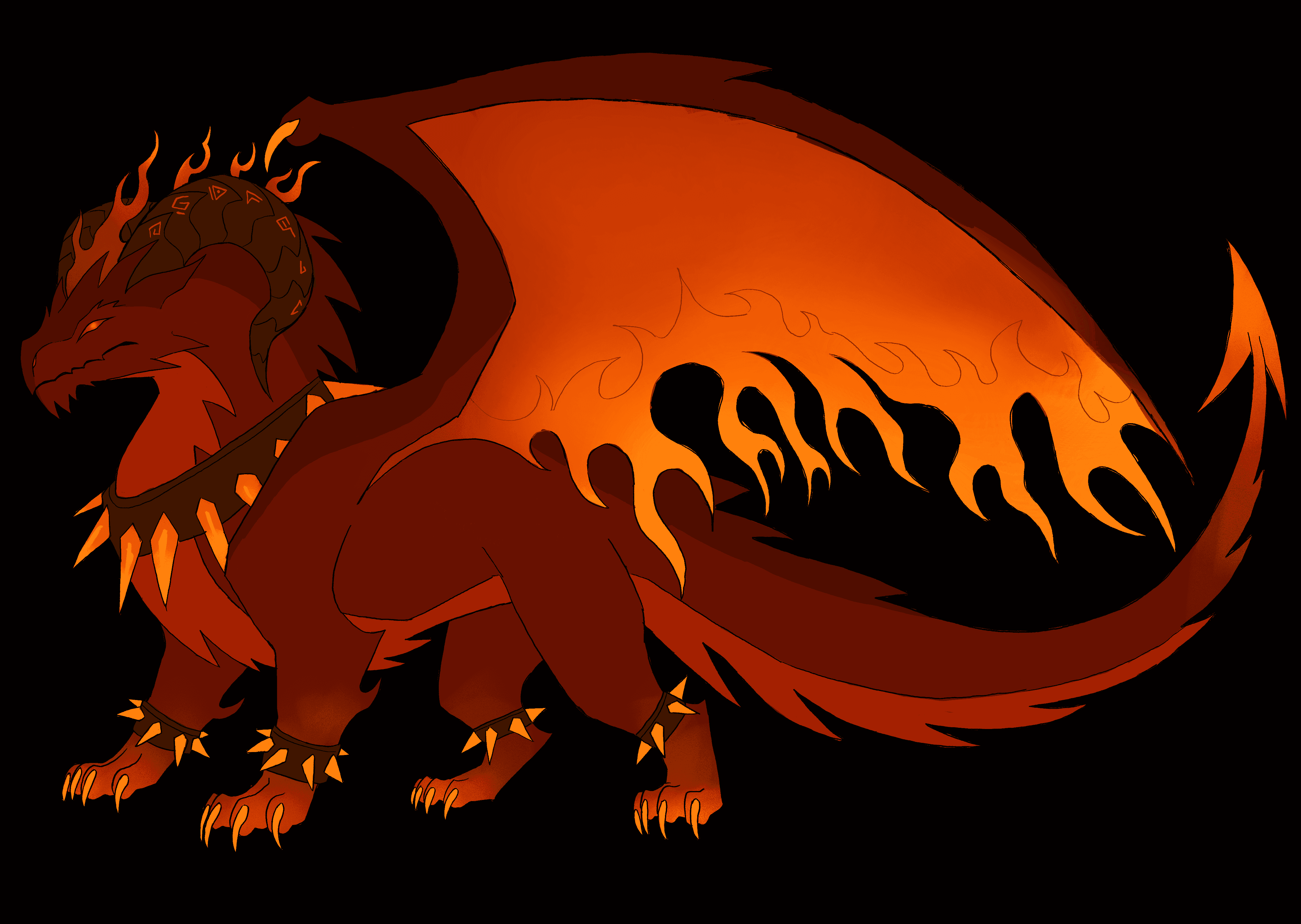
The resulting character designs are unique and distinctive, each easily recognizable through color, theme, and silhouette. The green acid creature is sly and graceful, borrowing traits from jungle panthers, cobras, and poison dart frogs. The blue ice creature is magnificent and pristine, with assets from snowy owls, caribou, and arctic wolves. Finally, the red volcano creature is intense and powerful, depicted as a flame dragon. The designs are fairly simple to aid later detailed illustrations.
Conceptual ideation
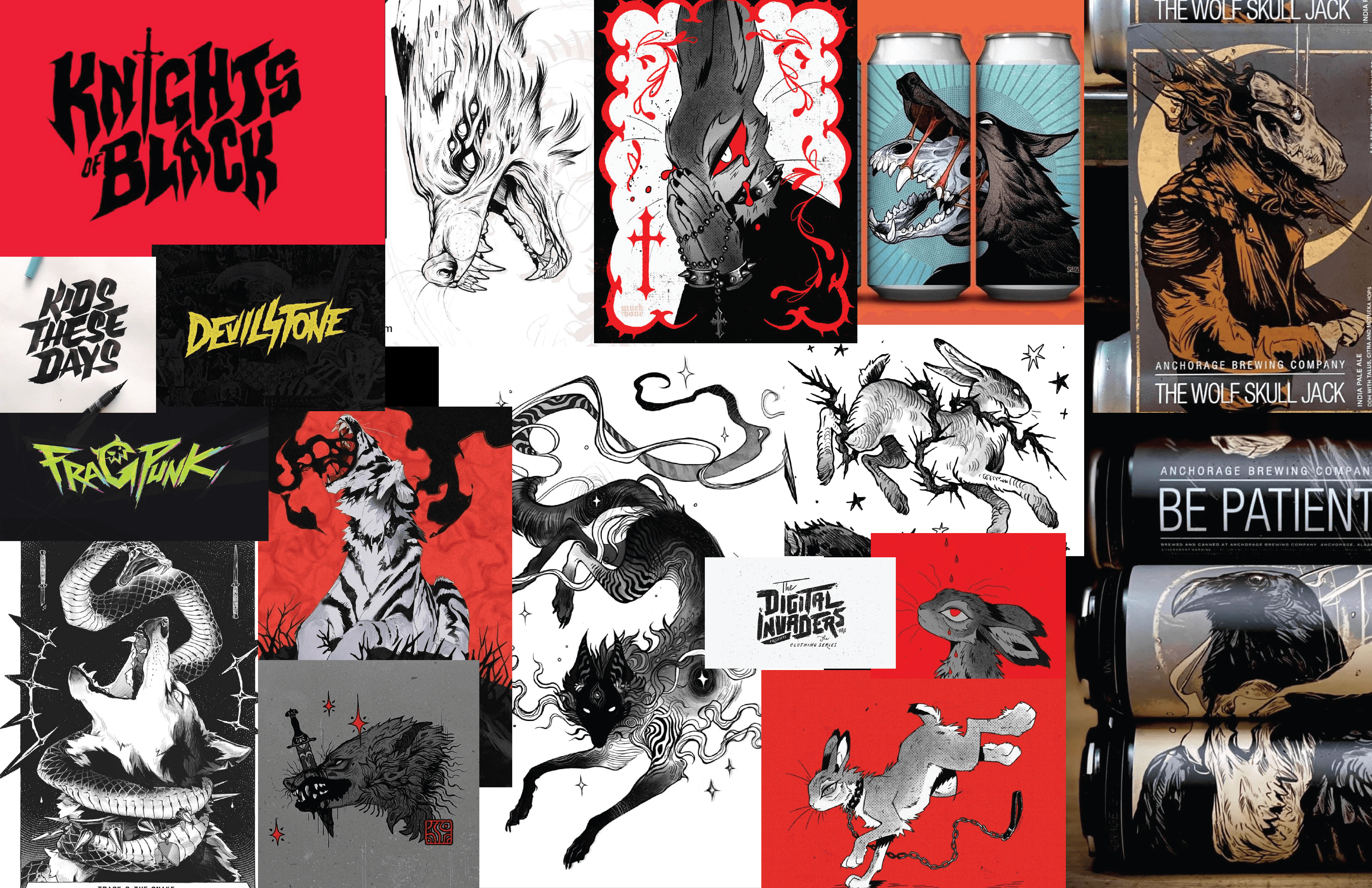
After nailing down what my creatures would look like, I created another moodboard for the illustration style and typography direction. I knew I wanted something sharp and expressive, so I took inspiration from traditional tattoos, heavy line-work, and a controlled use of colors for the illustration style. I felt it would also be fitting if the typography was somewhat slanted and textured for the illusion of movement and energy. I was lucky enough to find some incredible beverage examples with a similar style and base concept, so I gained a lot of inspiration.

After all of my visual research had been completed, I began sketching twenty possible compositions for my brand. I tried to really expand upon different concepts here, rather than just the pose or scale of the creatures. Some ideas focus on graffiti, stone carvings, or abstract shapes, while others depict summoning circles, relics, and royal heraldry. I ultimately decided to depict the creatures in a half-body position with all three snarling, focusing on heavy line-work.
Digital designs
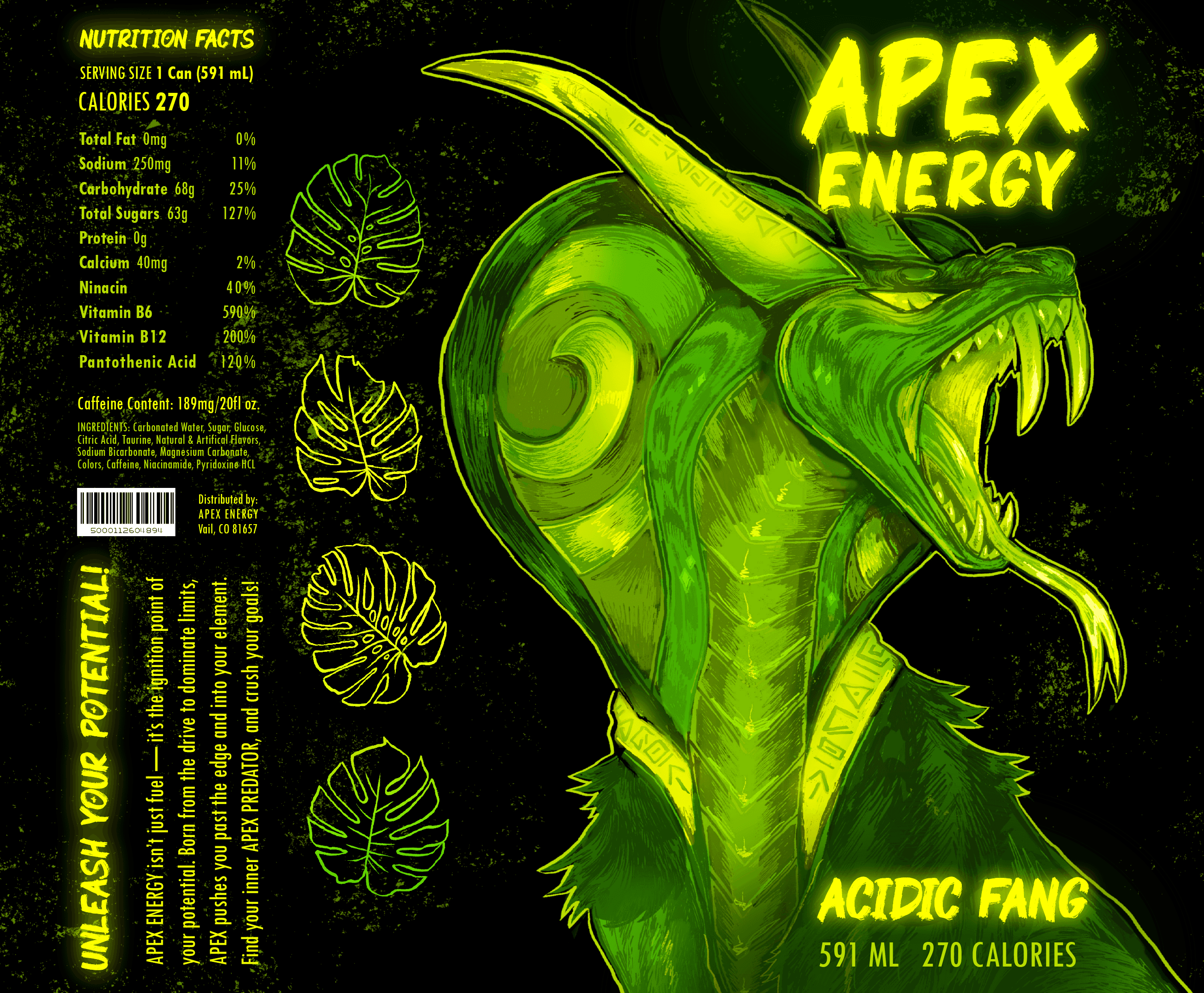
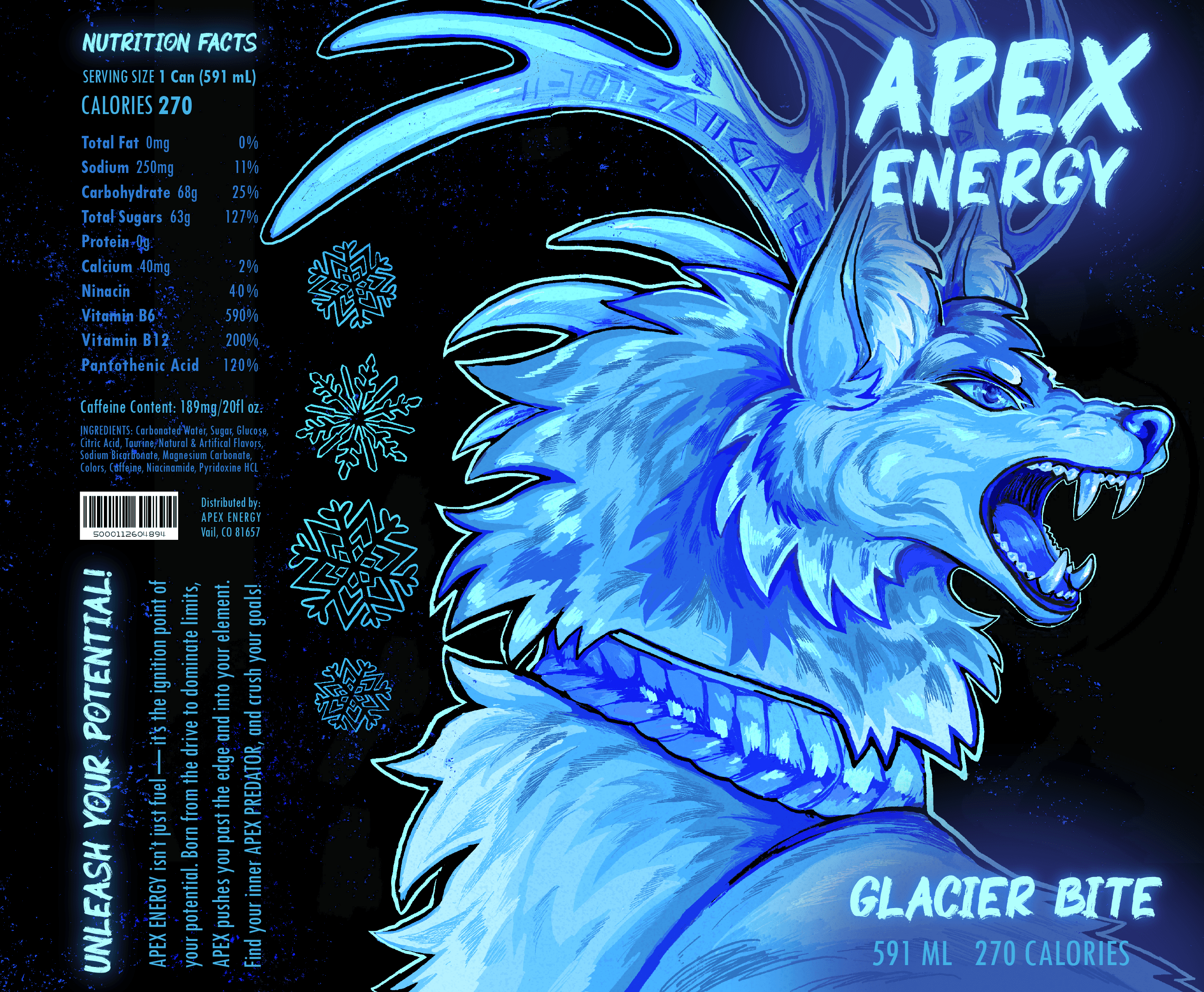
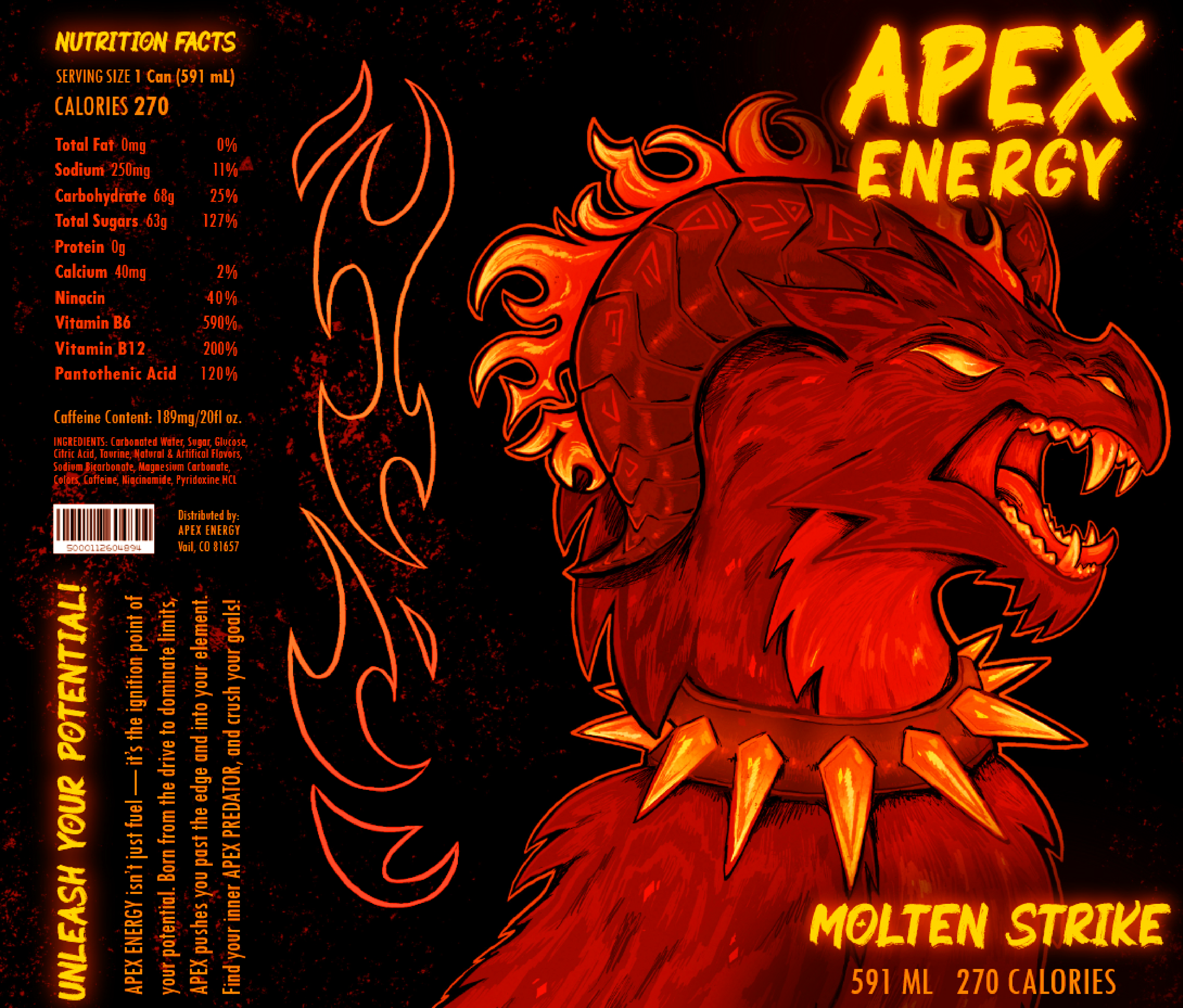
The finished designs read as impactful and striking, utilizing vivid yet controlled colors to help consumers recognize each flavor at a glance. These digital designs also feature simple illustrations of monstera leaves, snowflakes, and flames respectively to provide an abstract idea of each creature's domain. Glow effects were utilized with the title typography, while the nutrition facts and brand synopsis form a clean, unique rectangle that does not impede the existing design and color palette. Subtle texture was utilized in the background for further stylization.
Visualization


After the designs were completed, I further explored the composition by mocking up the designs in Blender and photographing the cans from a few different angles. I also tested some additional lighting effects to make the product display appear even more energetic and engaging visually.
‹